If you’ve ever found yourself frustrated with emails that just don’t seem to display properly on your smartphone, you’re not alone. The struggle is real. As a B2B marketer or sales professional, you understand the need to stand out in your recipients’ overcrowded inboxes. Mobile optimization is the key to ensuring your messages achieve these goals.
We will help you unlock the world of mobile optimized emails, discuss what mobile optimized email marketing is and why it matters. Plus, you will get essential tips and a template to optimize your email for mobile.
- What Is Mobile Email Marketing?
- Responsive Design
- Fluid Design
- Scalable Design
- Why Are Mobile-Friendly Emails So Important?
- 10 Essential Tips to Creating Mobile-Friendly Emails
- Subject Line Text
- Preheader Text
- Short and Valuable Content
- Left-Align Your Email Copy
- Optimize Your Images
- Keep CTAs Front and Center
- Deep Personalization
- Avoid Navigation Bars
- Make Social Media Icons and CTAs Touch-Friendly
- Design for Portrait and Landscape Views
- Mobile-Optimized Email Template
What Is Mobile Email Marketing?
Mobile email marketing is a crucial part of today’s email marketing strategies. It’s all about creating and improving email campaigns specially designed for mobile gadgets like smartphones and tablets.
Simply put, mobile optimized email marketing is about giving people great email experiences on their mobile devices. It recognizes that many of us use our mobiles for email and understands how much we rely on these devices.
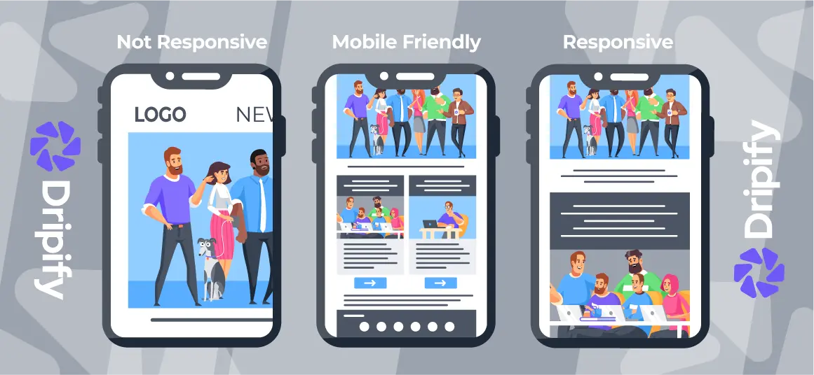
There are three approaches you can take to create mobile-friendly emails:
Responsive Design
Responsive design is a vital aspect of mobile email marketing. This approach ensures that your email content adapts to the screen size and orientation of the user’s device.
Whether a recipient is viewing the email on a small smartphone screen in portrait mode or a larger tablet screen in landscape mode, responsive design ensures that the email layout and content adjust for optimal readability and user experience.
Fluid Design
Fluid design uses percentages to resize tables and images based on the screen size they’re viewed on. It’s like the “liquid” layouts in web design, where elements adjust to the screen space available. This makes the content look good and work well on different devices, ensuring users have a great experience.
Scalable Design
Scalable design means creating emails that look great on both desktops and mobile devices – no need to tinker with code. It uses a grid system for alignment, emphasizes proportion, keeps a single-column layout, and uses larger buttons for easy use. This approach makes it a breeze to ensure your emails shine on all sorts of screens, whether it’s a computer or a mobile device.
Here are some tips to help you pick the right email design approach:
- If you don’t have many resources and aren’t familiar with CSS and media queries, consider using a scalable or fluid email design.
- If you have a skilled CSS and media queries team and your audience is mostly on mobile devices, go for a responsive design.

Why Are Mobile-Friendly Emails So Important?
So, why should you optimize your email for mobile? Well, recent statistics underline the critical importance of mobile-friendly email. These numbers reveal why adapting your email campaigns for mobile users is an absolute necessity in the world of B2B marketing and sales:
- Mobile Dominates Email Reading: According to “The 2024 State of Email” – mobile devices have become the most prevalent reading environment for emails, claiming a staggering 44.7% share. The implication is that a significant portion of your audience accesses their emails primarily through smartphones and tablets.
- Variability in Mobile Email Opens: “Mobile Email Statistics 2024“ – the prevalence of mobile email varies, accounting for anywhere from 26% to 78% of email opens.
This variance is influenced by factors such as your target audience, product type, and email category. It emphasizes that the extent of mobile email engagement can significantly impact your outreach marketing results.
Here’s what these numbers signify if you don’t use mobile-optimized emails:
1. Negative Email Metrics: Failure to optimize your emails for mobile users can lead to a decline in key email metrics, including lower click-through rates, reduced conversions, a diminished return on investment, and an increase in unsubscribes. In essence, your email campaigns won’t achieve the desired results and can even have a negative impact on your bottom line.
2. Poor Brand Reputation: When users don’t get what they expect from your brand, it can harm your reputation. Mobile users anticipate a seamless and visually pleasing experience. Failing to deliver on this expectation results in decreased engagement and can undermine your brand’s image and trustworthiness.
Explore why you must have a separate domain for cold email outreach.
10 Essential Tips to Creating Mobile-Friendly Emails
Now, let’s explore the ten essential tips to create a compelling, mobile-friendly email that gets you results.
Subject Line Text
Think of your subject line as the entrance to your email. On mobile screens, space is limited, and first impressions matter. As such, always keep your subject lines short, concise, and engaging.
With only 35 characters for a catchy subject line, you must make the most of it to boost your open rates on mobile devices. The goal is to make it immediately clear what your email is about and entice the recipient to open it.
Remember, a well-crafted subject line can significantly impact your open rates, so ensure it’s compelling and relevant to the email content.
Preheader Text
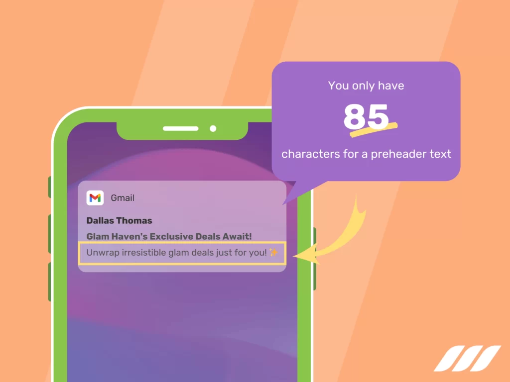
The pre-header text is the often-overlooked hero of mobile email marketing. The preview text appears next to or below the subject line on most mobile devices.
You only have 85 characters for a preheader text, so use it wisely to provide a sneak peek of your email’s content and value. Summarize the email’s core message or offer in a few words, giving recipients a compelling reason to open the email.
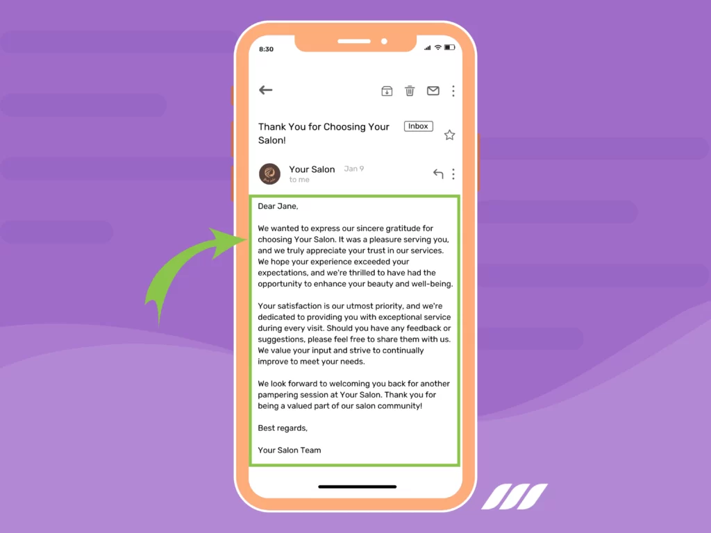
Short and Valuable Content
Mobile users value efficiency. They want quick, relevant information that they can consume on the go. To cater to their preferences, keep your email content concise, focused, and easy to scan.
1. Keep It Short and Sweet: In a world of fleeting attention, brevity is your best friend. Your email content should be concise, with every word serving a clear purpose. Long-winded intros for paragraphs won’t cut it. Instead, craft concise sentences and paragraphs that get straight to the point.
2. Clarity is Key: Ensure that your message is crystal clear. Mobile users prefer clarity over complexity. Avoid complex jargon and lengthy explanations. Instead, use simple, straightforward language to ensure your message is instantly understandable.
3. Stay Focused: Mobile emails are not the platform for lengthy discussions. Your content should revolve around a single, well-defined message or call to action. Define your email’s primary purpose and ensure your content aligns with that goal.
Left-Align Your Email Copy
Reading from left to right is the natural flow for most languages. When you left-align your text, you ensure it’s easy for users to read and follow the content. This simple formatting choice helps with readability and makes the email more user-friendly, especially for languages that read from left to right.
In center-aligned text, especially in long passages, the starting point changes with each line, requiring readers to exert extra effort. However, left-aligning your email copy simplifies the reading experience, making it more user-friendly and efficient for your audience.
Optimize Your Images
We all want our email images to look fantastic, but chasing high quality can sometimes lead to large images that take forever to load, causing a frustrating user experience.
A simple solution is to optimize your images to get the best of both worlds – fast performance and professional quality. This means making them smaller in file size while keeping them just as visually appealing.

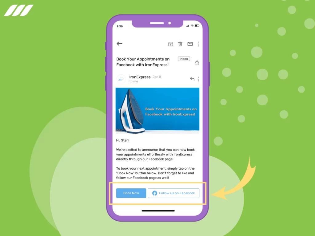
Keep CTAs Front and Center
Your email’s success hinges on your Call to Action (CTA) to a greater extent. A “front and center” call to action (CTA) is like putting the most important button right in front of your eyes. It’s big, bold, and easy to find, usually at the top of an email.
This way, it’s one of the first things you see, and it’s designed to get you to take a specific action, like buying something, subscribing, or clicking a link. It’s all about making that button stand out and encouraging you to do what the website or email wants you to do.
What’s more, use buttons for CTAs instead of text links, as buttons are more prominent and easier to tap on a touchscreen. The CTA should be visually striking and clearly convey the action you want the recipient to take.
Deep Personalization
Personalization is a powerful tool for engagement, making it a crucial element of mobile optimization for an email. Addressing the recipient by name is so basic; you must try to go deeper.
For instance, it is a good idea to personalize the content based on the recipient’s behavior, preferences, or location. When users feel like you understand their needs, they’re more likely to engage with your emails.
Avoid Navigation Bars
Mobile screens are limited in size, making navigation bars impractical. They take up precious space and clutter the email. Instead of using navigation bars, focus on delivering a single, clear CTA. Consider a minimalistic menu that doesn’t overwhelm the screen if additional options are necessary.
Make Social Media Icons and CTAs Touch-Friendly
If your email includes social media icons or additional CTAs, ensure they are easy to tap and interact with on a mobile screen. The touch-friendly design is essential, making it effortless for users to engage with your brand across various platforms. Don’t forget to use icons that are large enough for easy tapping.
Design for Portrait and Landscape Views
Users can transition between portrait and landscape views on their mobiles, depending on how they hold their devices. Test your emails in both orientations to ensure a consistent and pleasing experience. This guarantees that your content looks good and functions well, whether the user holds their device vertically or horizontally.
Read also: Email Outreach Tracking
Mobile-Optimized Email Template
To make things easier for you, here’s a basic mobile-optimized email template that you can customize for your campaigns:
Subject Line: [Engaging Subject Line – 35 characters]
Preheader Text: [Compelling Preview Text – 85 characters]
Main Content:
- [Introduction]: A brief and engaging introduction that sets the stage for your email’s content.
- [Short and Valuable Content]: Present your main message, offers, or information succinctly and with clarity.
- [CTA Button]: A prominent call-to-action button, making it easy for recipients to take the desired action.
Signature
[Your Name]
[Company Name]
[Contact Information]
Want more inspiration for creating amazing emails? Check out these tried and tested email outreach templates.
Conclusion
Mobile users are a demanding audience. They appreciate emails that respect their time and screen space. Your goal is to make their experience seamless and valuable. So, get started on crafting your mobile-friendly emails and watch your outreach marketing efforts soar.

![Email Outreach Tracking [Tips, Tricks and Tools]](https://dripify.io/wp-content/uploads/2025/02/11-7-png.avif)
![Create a Prospecting Plan [+8 Prospecting Methods]](https://dripify.io/wp-content/uploads/2025/02/11-png.avif)
